Exploring Cold Colors
Floarea Bänziger
02 Oct 2023
41
Floarea Bänziger
02 Oct 2023
41
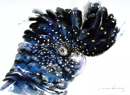
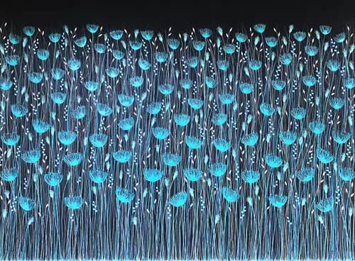
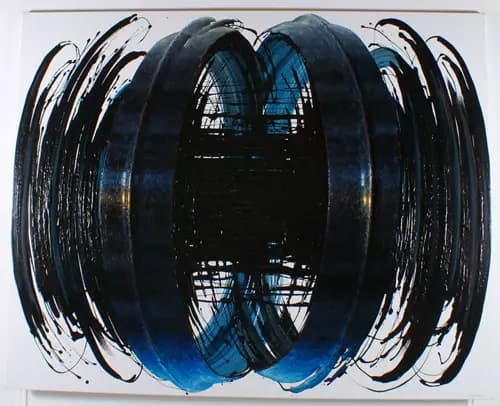
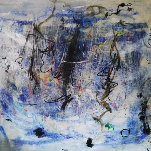
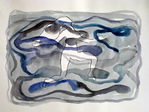
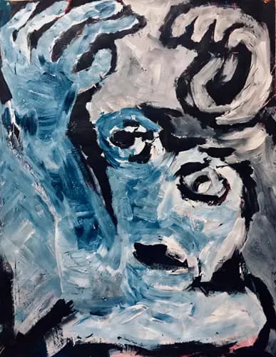
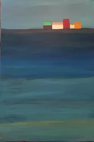
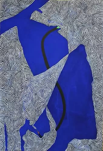
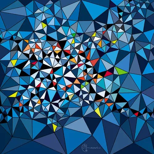
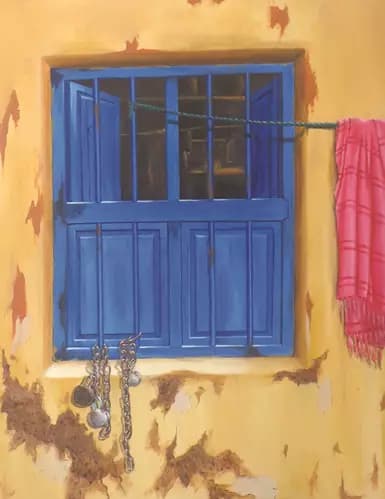
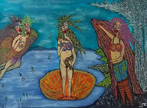
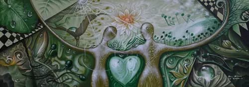
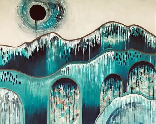
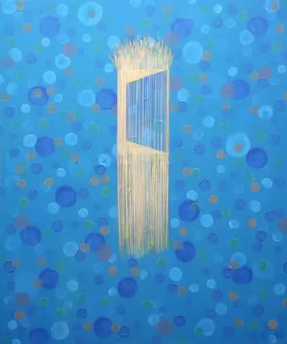
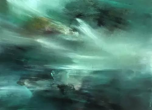
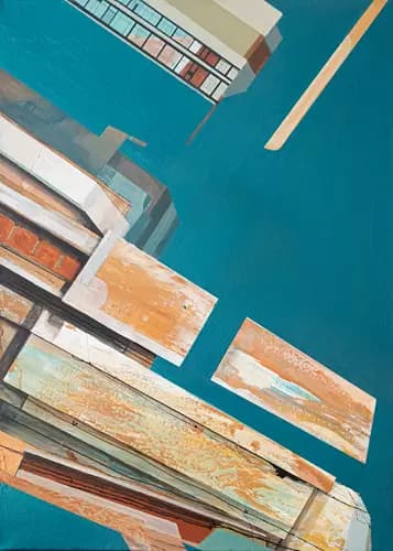
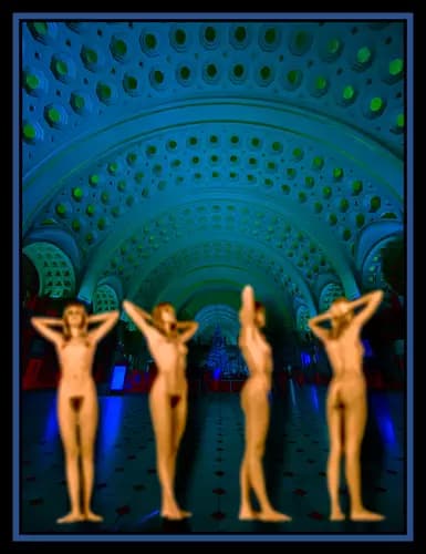
The color choices and the relationships between colors have a huge influence on how an artwork is emotionally perceived. Color psychology maintains that cool colors are evoking different feelings than warm colors. Cool hues, from blue to green and violet, conjure images of nature and are considered calm, relaxing colors. When placed in smaller rooms, cool shades make the area feel bigger.
No other form of art tells better the story of the color blue than the history of ceramics. The blue glaze originated in Persia probably as early as 9th century A.D. Later, around the 14th century, the Chinese imported the cobalt pigment and created a new style of decoration based on sinuous depiction of natural elements. It was widely exported and by the 17th century, it inspired imitative local styles, in Japan, Islamic ceramics, and in Europe - Delftware in the Netherlands, Italy and Britain. With early examples being highly sought after, blue and white pottery continues to be produced today.
In modern art, Picasso created between 1901 and 1904 monochromatic paintings in shades of blue and green. This melancholic stage in his career is known as The Blue Period. Another artist deeply passionate about the color blue was Yves Klein. Klein famously declared the blue sky to be his first artwork and continued finding radical new ways to represent the infinite and immaterial in his monochromatic abstract works. The shade of pure ultramarine that he claimed to have invented and trademarked is now known as IKB (International Klein Blue). Enjoy a selection of artworks exploring the meaning and emotions associated with cool colors.
The color choices and the relationships between colors have a huge influence on how an artwork is...